Rent the magic, keep the memories
.png)
Role
Team Lead
4 Designers
6 Weeks
Responsibilities
Product Design
Product Management
Strategic Thinking
The Bay Area’s rich cultural diversity makes the holiday season vibrant and unique, but many residents encounter obstacles when trying to celebrate to the fullest. Limited living space, tight budgets, and the lack of access to culturally inclusive decorations can make it difficult for individuals and families to express their traditions meaningfully. These barriers often lead to feelings of exclusion or compromise, especially during a time meant for joy, connection, and cultural pride.
.png)
Dekor is a decoration rental app designed to make decorating easier for bay area residents. We wanted to create an app that empathized with people living in a busy city with limited space, as well as, people from different cultures and limited funds. Users can find products they like in our app, rent them out for any given time, and then return those items at our provided locations.
Features found in this app include decoration rentals that can be sorted by holiday, culture, season, and more, deals and bundles that make renting affordable and customizable, in-depth product detail pages, a personalized profile, a cart for your products, rental date selection, payment, and return.
Our goals focused on reducing cost, space, and waste for the user, while increasing our business' revenue, user base, and brand image
Users will:
→ Save money
→ Save space
→ Reduce waste
→ Obtain diverse products
→ Get delivered decorations
Measured By:
→ Money saved on decorations yearly
→ Space used for decorations (sq. ft.)
→ Customer satisfaction by reviews
Dekor will:
→ Generate revenue
→ Increase user acquisition
→ Increase customer retention
→ Improve brand image
Measured By:
→ Revenue made in a year
→ New users onboarded in app
→ DAU/MAU/YAU
→ Customer satisfaction by reviews
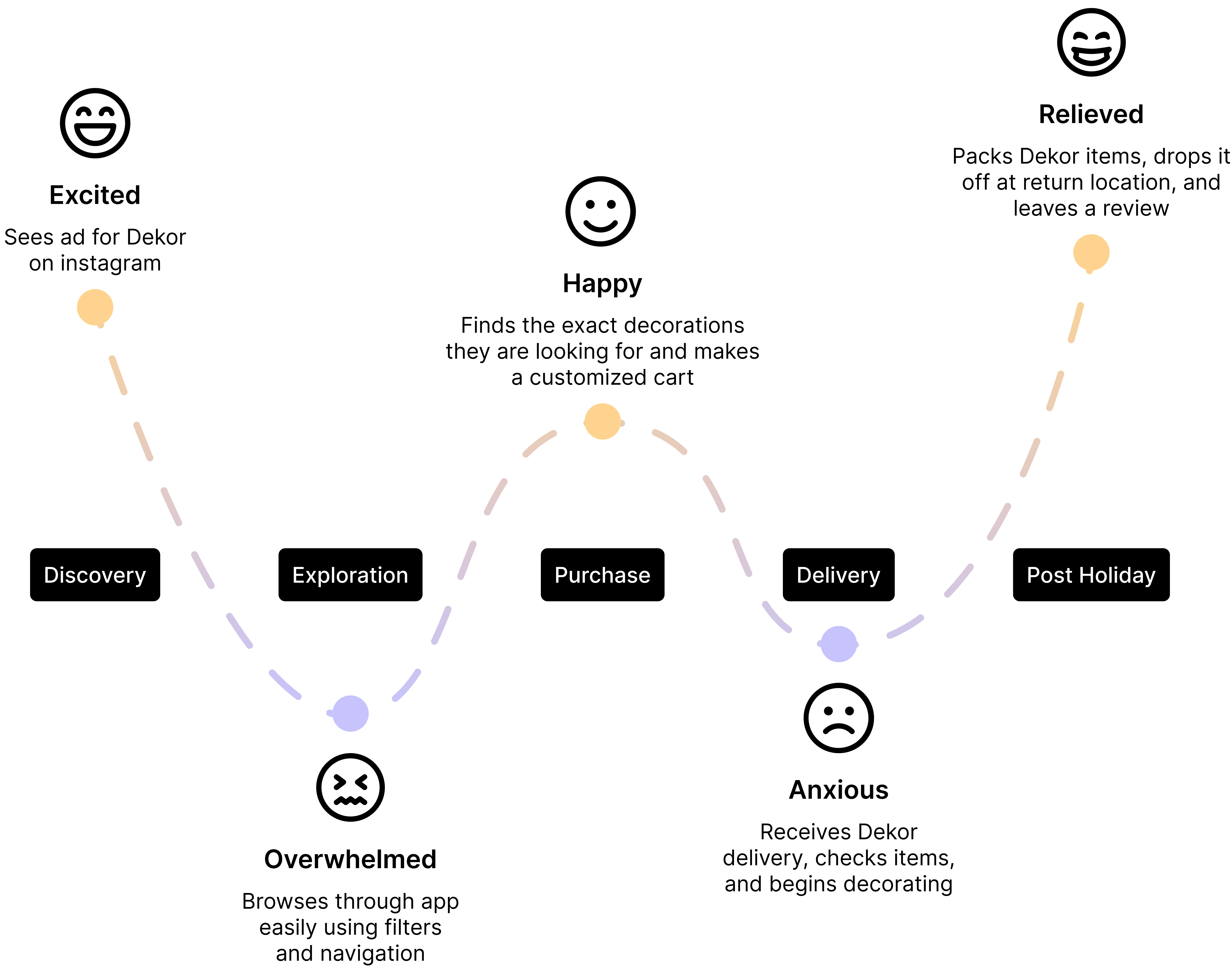
Our objective for conducting research was to understand if this was a real problem bay area residents faced. We wanted to understand why this app wasn't already in the market and the logistics behind creating a business around decoration rentals. Our team looked through secondary resources, conducted user interviews of our target audience (bay area residents), and did a competitive audit.
→ Decoration lead to a ton of waste every year
→ SF residents spend a lot of money on decorations every year
→ There isn't enough storage for decorations
→ Decorating is a lot of work
→ There aren't a lot of cultural decoration options
→ Decorations are hard to keep organized
To understand the real challenges our users faced, we turned to the Lean UX Canvas, user personas, journey maps, and a competitive audit to make sense of our research.
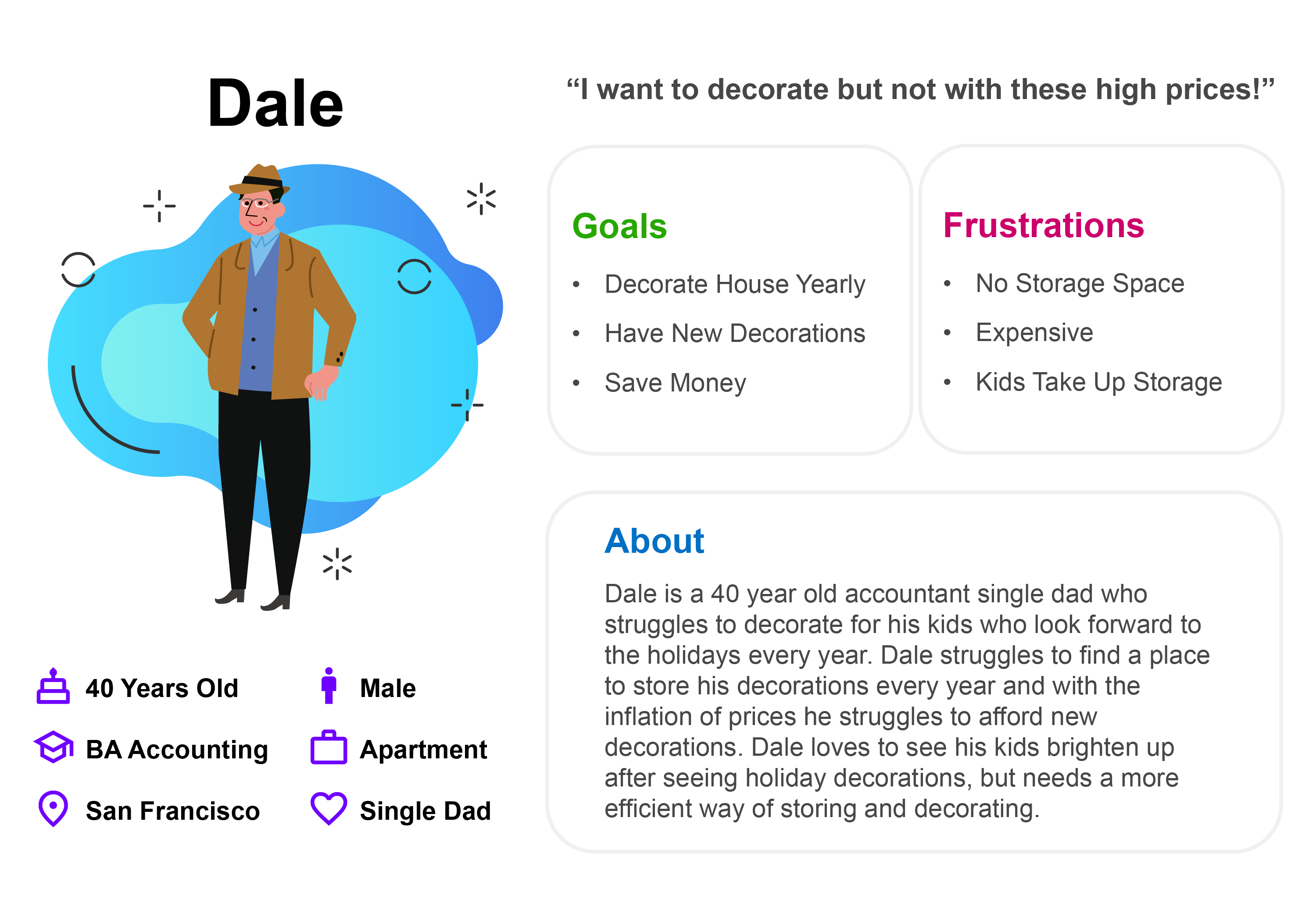
Dale is a father who loves making the holidays magical for his kids. Every year, he dreams of decorating his home, but storage space is tight, and buying new decorations quickly adds up. For Dale, the challenge is finding a way to bring joy to his family without breaking the bank or crowding his apartment.
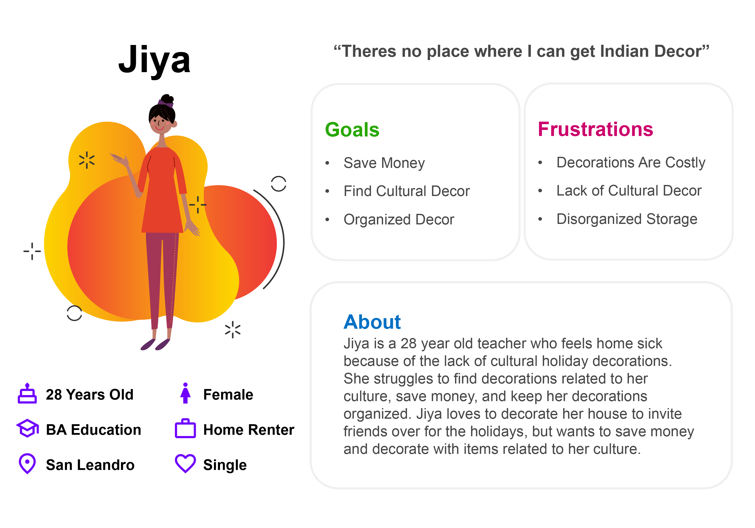
Jiya’s story is different. She’s constantly searching for decorations that reflect her cultural traditions, but the options are limited and often expensive. What she really wants is access to beautiful, affordable decor that feels authentic and meaningful, something that helps her celebrate in a way that feels true to her roots.
In our competitive audit we discovered that their was a critical problem among decoration rental services; most of them focused only on Christmas and none of them considered people from other cultures. Our team saw a real opportunity to create an app that would include decorations for a diverse group of people while allowing our customers to save money, time, and space.
→ All focused on Christmas and weddings
→ All apps are pitched as saving space, money, and time
→ Some offer delivery/setup services
%20(3).png)
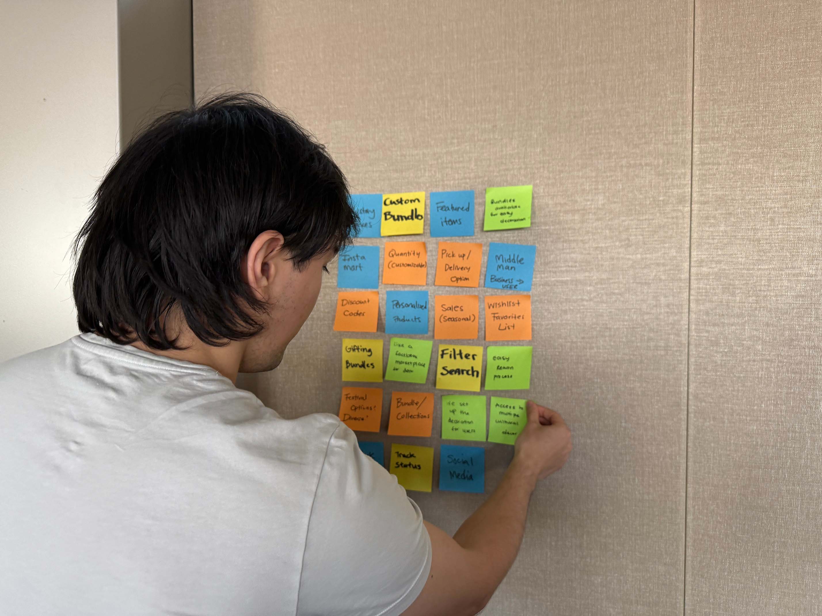
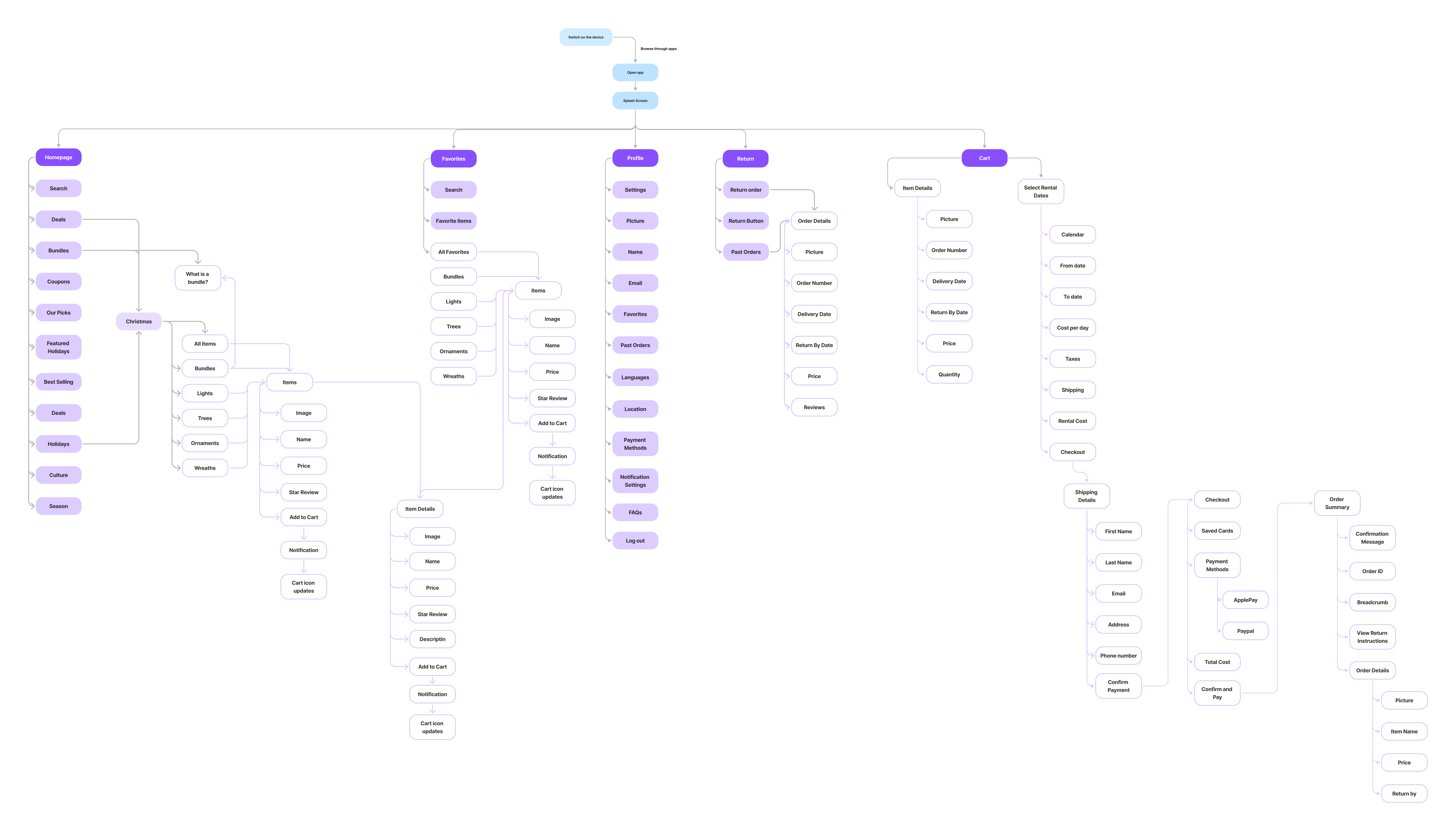
With a clear problem in mind, our team of four designers moved into ideation. To explore potential solutions, we used card sorting to collaboratively define the app’s core features. This process helped us identify key screens like cultural filters, a streamlined checkout, and a return delivery system. From there, we built out the information architecture, laying the groundwork for a product that wasn’t just intuitive but also realistic to implement. With a solid structure in place, we brought our ideas to life through wireframes, then ran A/B tests to refine the user flow and ensure every step felt seamless.
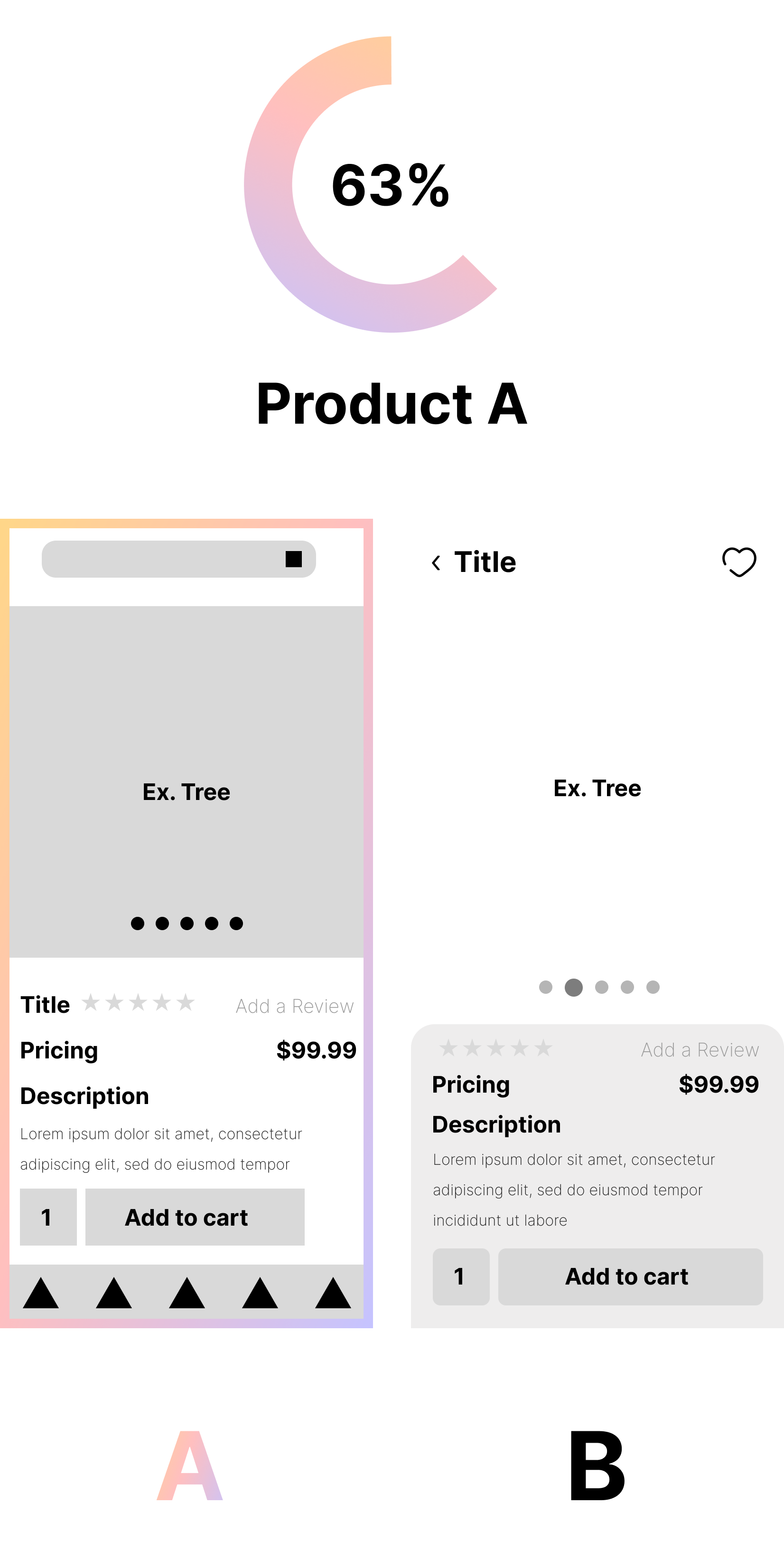
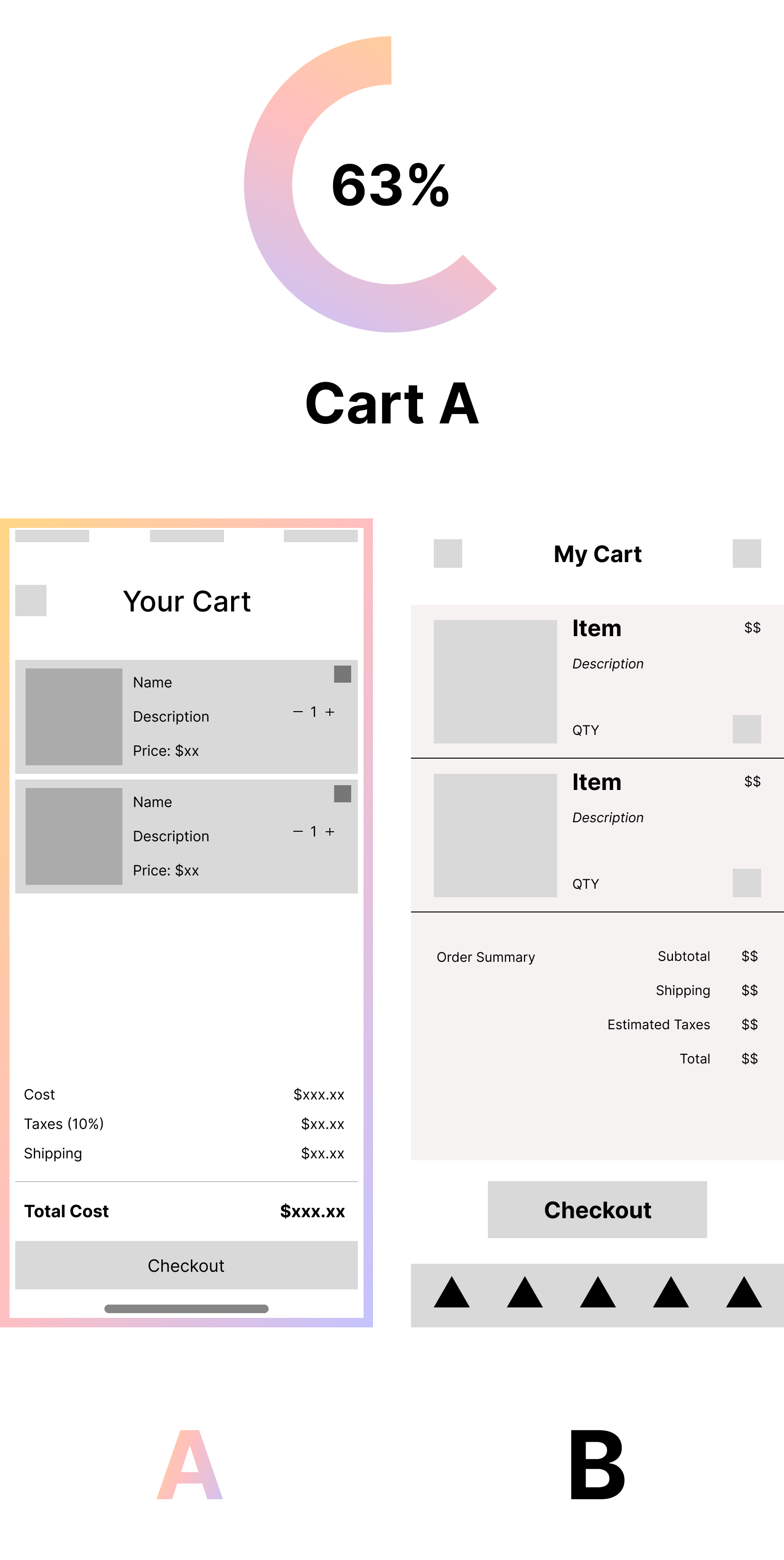
We conducted A/B testing on four different key screens: homepage, holiday page, product page, and checkout. The sample size for each screen was 16 votes. In addition, we asked questions to better understand what users wanted to see on the screen and what they didn't like. Our tests allowed us to use the preferred screens with alterations based on the user votes and interviews.
Homepage
During our A/B testing, users generally preferred Page B due to its more intuitive navigation, particularly the top pill-style buttons which improved usability. They also liked the placement of best seller items at the top. However, many participants expressed a desire to retain elements from Page A, such as the prominent featured holiday banner. These elements were seen as important for driving engagement and highlighting key content.
Holiday Page
On the Holiday page, Page B emerged as the favorite thanks to its improved layout, which allowed users to view products more clearly and closely. Additionally, the smaller, more focused category section at the top of Page B was appreciated for reducing visual clutter and helping users quickly focus on products that mattered most.
Product Page
For the Product page, users favored Page A over Page B. The primary reasons were aesthetic and familiarity; Page B’s rounded corner sections were not well received, and users preferred the more conventional, cleaner design of Page A. This familiarity was key in building user trust and ease of use during browsing.
Checkout Page
In the checkout flow, Page A was preferred for its clear cost breakdown and well-defined visual hierarchy, which helped users easily understand their order summary. However, the add/remove item functionality raised concerns; users felt it was too easy to accidentally adjust item quantities. As a result, we removed this feature. Additionally, users disliked the visual backdrop in Page B, finding it distracting and unnecessary for a checkout experience.
.png)
.png)
.png)
We tested our decoration rental app wireframes with a diverse group of users, who generally described the design as clean, familiar, and visually appealing. While the layout was well-received, several usability issues surfaced. Users struggled with inactive elements like the bundle button and had difficulty locating or returning to the cart due to minimal visual feedback. The bundles themselves were unclear, users didn’t know what was included or if they could customize them. Product pages lacked basic details such as tree size and type. The checkout process was smooth; return flows were simple but didn’t allow item-specific selection or give enough guidance for large returns.
We Needed to:
→ Make more buttons active to improve navigation and flow
→ Add more information to products listed
→ Make certain call to actions like the return button more clear
→ Add the return button to the bottom navigation
→ Add the cart button to the product page
Users responded positively to the updated decoration rental app prototype, praising the clean design, strong visuals, and clear flow. The overall experience was described as seamless and intuitive, especially during checkout. Users enjoyed interactive elements like swipe gestures and appreciated the upfront pricing. However, there were still usability gaps, the return process was smooth but lacked support for damage notes, multiple order returns, and early return options. Users also noted missing features like a detailed “About” section, better calendar functionality, and clearer feedback during item selection.
We Needed to:
→ Improve order return selection
→ Make an about page to explain how the app works for common questions
→ Improve calendar functionality
.gif)
.gif)
.gif)
.png)
User testing revealed a strong overall reception to the app's design and functionality. Participants consistently praised the clean, professional look and described the interface as intuitive and easy to navigate. The visual style was highlighted as “pretty” and “realistic,” with several users noting it felt like a fully developed app. Features such as swipe interactions, upfront pricing, and the clear layout of bundles were well received. Users appreciated how seamless the checkout process felt and liked that the navigation was straightforward. The visual design drew favorable comparisons to platforms like Pinterest, and many users expressed that they would use the service in real life, especially for seasonal events like holidays or weddings.
Effective Team Leadership
Leading a team of close peers taught me the importance of clear timelines, transparency, and open communication. Balancing friendship with accountability was challenging, but setting expectations early, understanding each member’s strengths, and learning the complexities of creating unified design systems helped us stay on track.
Why User Testing Matters
User testing showed us that what feels intuitive to us as designers doesn’t always translate to real users. Testing with non-designers revealed unexpected pain points and helped us see where our flows needed improvement.
Designing Clear, Fast Navigation
We learned that navigation should always feel quick and intuitive. Users appreciated having multiple ways to access key pages, and we saw firsthand how important it is to avoid confusion or dead ends.
Add More Interactable Pages
To improve usability and engagement, we want to make several key pages fully interactive like the Shop Sale page, featured items page, and information sections such as damaged goods and FAQs. These additions will help users explore more of the app naturally and reduce confusion around non-functional elements in future prototypes.
Personalize the App Experience
We aim to make the app feel more tailored to each user by introducing features like favorites, saved preferences, and personalized recommendations. A stronger user profile system will help create a more engaging and relevant experience for users.
Refine User Flow and Navigation
Future iterations will focus on making navigation even smoother by simplifying user paths and improving feedback throughout the app, ensuring users can always find what they’re looking for without getting lost.
.png)