Helping Doctors Track Their Credentials
.avif)
Role
UX Intern
Team
Project Manager
Sr. UX Designer
UX Designer
8 Weeks
Methods
Product Design
Strategic Thinking
User Research
Card Sorting
Wireframes
Prototyping
User Testing
Tools
Figma
Slack
What Is Medical Credentialing?
At BilliMD, we help doctors manage medical credentialing, the process that verifies their qualifications with insurers to ensure patient safety and quality care.
The Problem
The credentialing process is slow and varies across insurer, doctors need to manage multiple applications and scattered updates across platforms. With little visibility into progress or errors, they often miss urgent fixes that lead to delays and lost revenue.
The Internal Challenge at BilliMD
BilliMD relied on spread sheets to communicate progress. When issues arose, doctors received buried, text-heavy messages, making it hard to spot problems or act quickly.
Consequences of the Problem
85% of credentialing applications are delayed, costing doctors up to $120K each and over $1B nationwide in lost revenue.
Solution
To fix that, we created the Credentialing Tracker, giving doctors real-time insight across insurers to stay organized and avoid delays.
.png)
.png)
On one side are individual doctors (B2C) seeking a simple way to track their credentialing progress across multiple insurers and upload documents for review. By uploading through BilliMD, we can catch missing files and errors before submission.
On the other side are hospitals (B2B) that use BilliMD to manage credentialing for entire teams. Admins oversee multiple doctor accounts, reviewing updates and document uploads all in one place.
.png)
.png)
We conducted six user interviews and captured key insights on individual cards, then used affinity mapping to cluster recurring pain points across the spreadsheets BilliMD used to communicate with doctors. This surfaced common issues around task organization, filtering, and the difficulty of quickly identifying urgent errors.
.png)
.png)
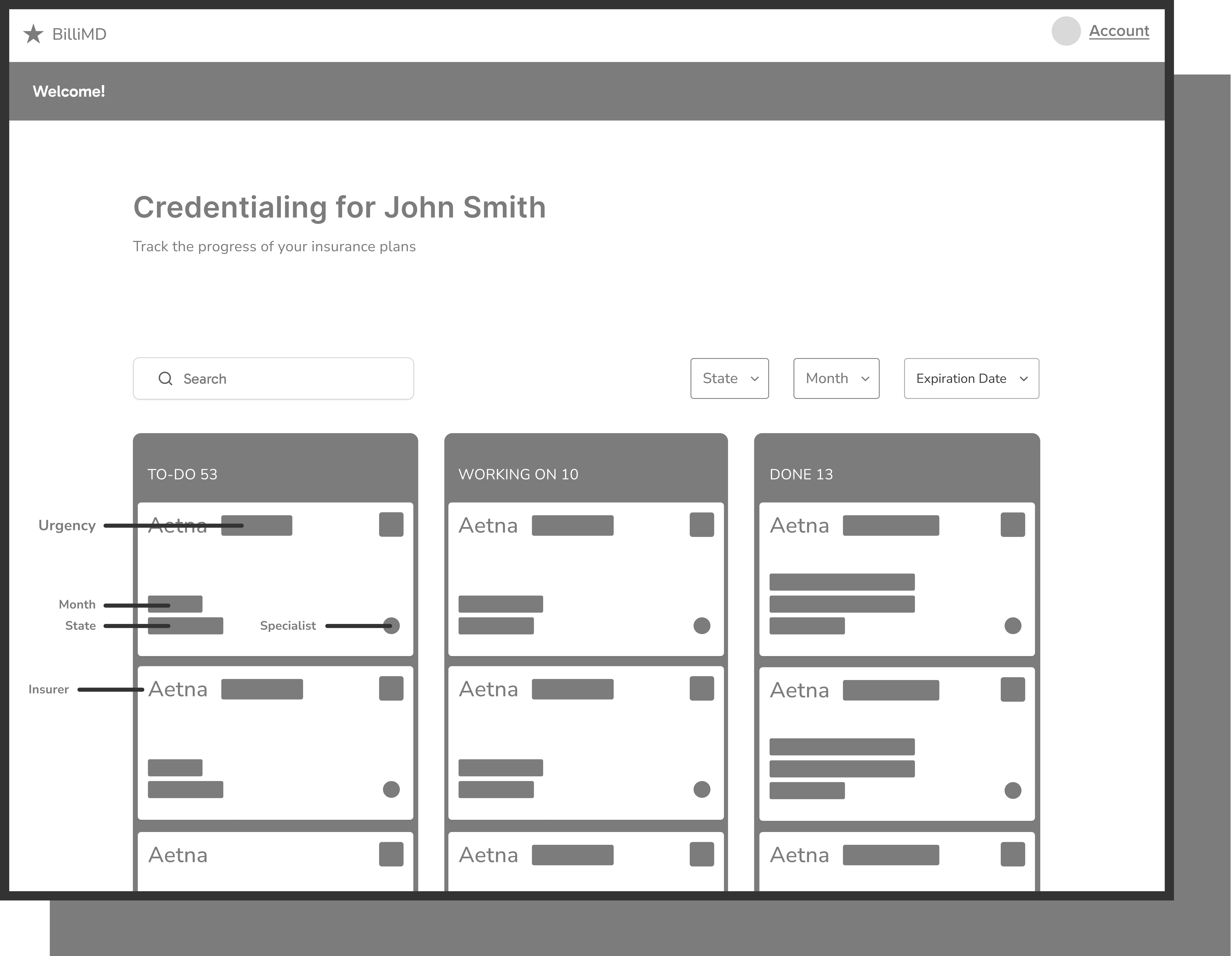
When creating wireframes, I focused on fixing key issues in the original spread sheet-based system; no filtering, poor visual hierarchy, and too much information at once. My goal was to design a layout that felt clear, organized, and easy to act on.

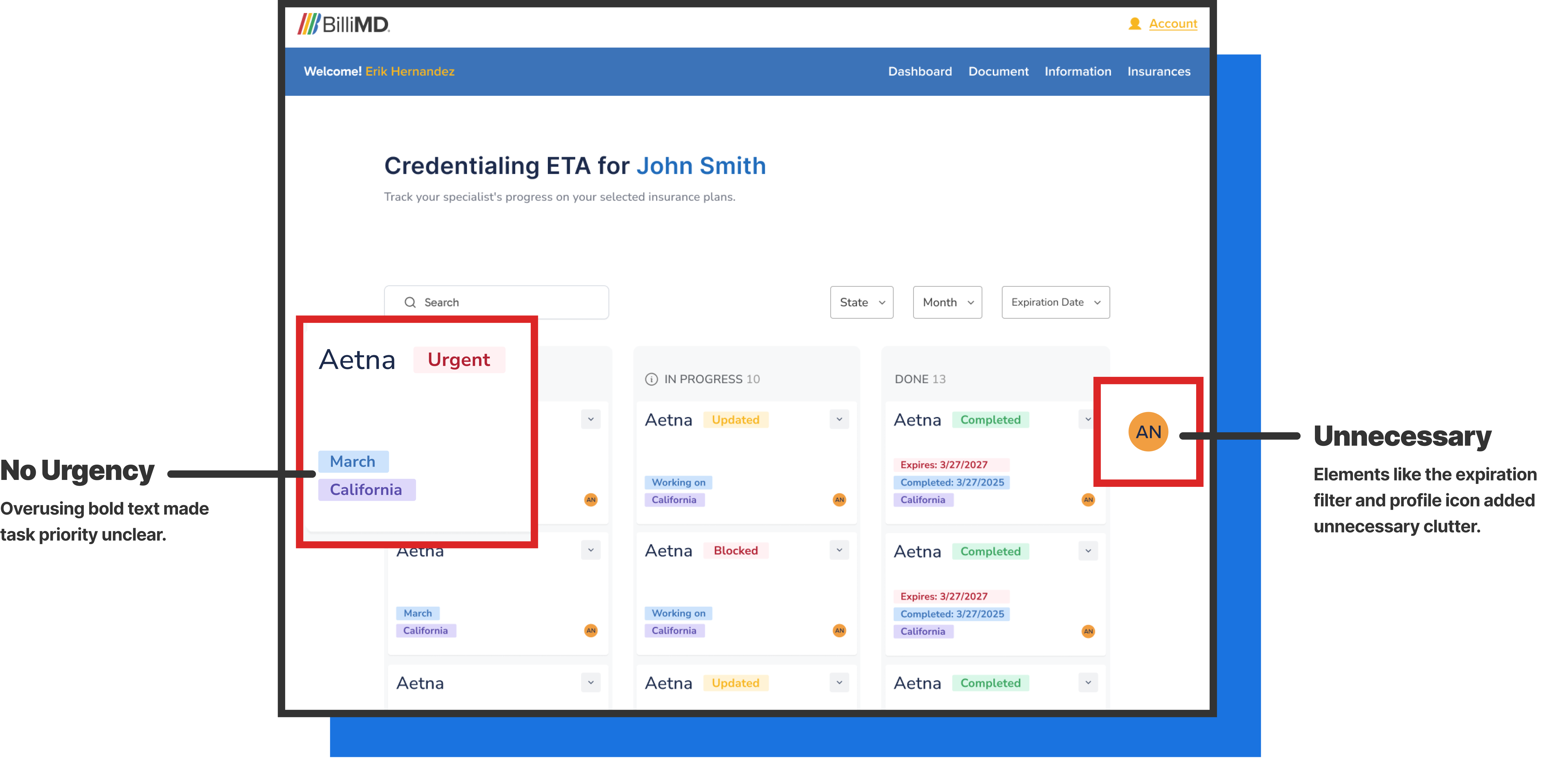
I tested the first version of the Credentialing Tracker with users. They appreciated the progress tracking and filters but struggled with what to prioritize.

In the second round of designs, I focused on using bold text more intentionally, clarifying task priorities, strengthening visual hierarchy, and removing clutter; however, expiry dates lacked sufficient visibility. Doctors needed clear visibility into when re-credentialing was required.
.png)
.gif)
.gif)
.gif)
Just as we wrapped up the project, stakeholders requested a full visual redesign to modernize the website’s look and feel. We introduced an icon-based navigation bar to improve visual communication, shifted to a horizontal layout to better align with our content structure, changed our typeface and the weight of headers to improve visual hierarchy and responsiveness across devices, and added a chat tab on the navigation bar to improve communication between doctors and our team. Since the user flow was already strong, our primary focus was on enhancing clarity and visual consistency. Stakeholders appreciated the modernized interface and saw immediate value in the chat feature, which improved communication with doctors and helped streamline workflows to better support business goals.
.png)
.png)
After launching the Credentialing Tracker, doctors were able to act faster and make fewer mistakes. By giving them a clear view of their application progress and flagging issues early, we cut the average response and document upload time by 40%, from 16 days to about 9. Our built-in AI models also reduced document errors by 95%, automatically catching missing files and typos before submissions went to insurers. We verified the AI’s accuracy by manually reviewing 50 sample applications and found it identified nearly every mistake. Since launch, doctors have successfully submitted over 140,000 documents through the platform. With fewer errors and smoother workflows, we’re already seeing a projected 25% drop in rejected applications, giving doctors and hospitals more confidence and control when managing their credentialing with insurers.

Looking back, I wish we had allocated more time for user testing. Toward the end of the project, stakeholders requested a complete redesign of both the product and the website, introducing a new constraint compressed our timeline and limited opportunities for iterative feedback. As a result, our focus shifted primarily to the desktop experience, leaving less time to validate the mobile and tablet designs.
This project taught me the importance of designing with clarity in complex systems like medical credentialing. Early testing showed that too many bold tags slowed doctors down, so I focused on organizing information and guiding attention. When stakeholders requested a full visual redesign near the end, I had to adapt quickly, refining the visuals while keeping the user flow strong. Collaborating with developers and stakeholders taught me that clear communication and smart prioritization can turn unexpected changes into stronger design outcomes.